
Creating a human-centered learning management system
Scroll ↓
How can we make learning management systems work better for students in higher education?

👓 The Specs
Timeframe: 16 weeks
My role: UX Researcher
Team: Jess Lilly (UX Researcher), Matthew Finger (UX Designer), Arnav Das (UX Designer)
Methods: Survey, semi-structured user interview, storyboard, hierarchical task analysis, usability test, task analysis
Tools: Qualtrics, Figma, Excel, Miro, Zoom

👤 Who exactly are our users?
The US education system has many stakeholders with different needs:
Students
Instructors
Administration
The organization of learning
And the students themselves are extremely diverse:
Individual learning goals and needs
Variation in field of study
Variation in cognitive, mental, or other ability
Variation in cultural and linguistic background
Variation in age, generation, and tech literacy/dependency
Do we focus on the needs of the instructors 👨🏼🏫 or the students 👩🏼🎓?
Focusing on both within our timeframe would make the scope too large. For now, we had to pick a user group and focus on them.
But, we also couldn’t neglect the needs of the other, since any LMS is two-sided.
Due to the ease of recruitment, we decided to focus on students in higher education.
From our competitor analysis and literature search, we found that Canvas and Blackboard dominated the market. Learning management systems are extremely popular and widespread; LMS has most of the tools needed to run a successful class and be a successful student, and yet, as students, we’ve encountered the following problems:
Inconsistencies among classes
Frustrating information architecture
Ineffective communication between students and instructors
🔎 We decided to focus on Canvas as a starting point.
The plan was to use it as a reference for the design features and flaws of LMS, both generally and specifically, and work our solution off of that.
Because we had easy access to a population of students who use Canvas, this was ideal, and we could begin surveying and interviewing them.
🗒 Research Procedure
Survey
We wrote an extensive survey which was intended to capture students’ Canvas experience, habits, sentiments, and pain points.
Questions included notification checking preferences, customization habits, emotions felt, habits, and features used/not used.

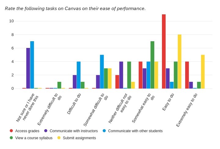

Some visualizations for data collected from the survey.
📑 Hierarchical Task Analysis
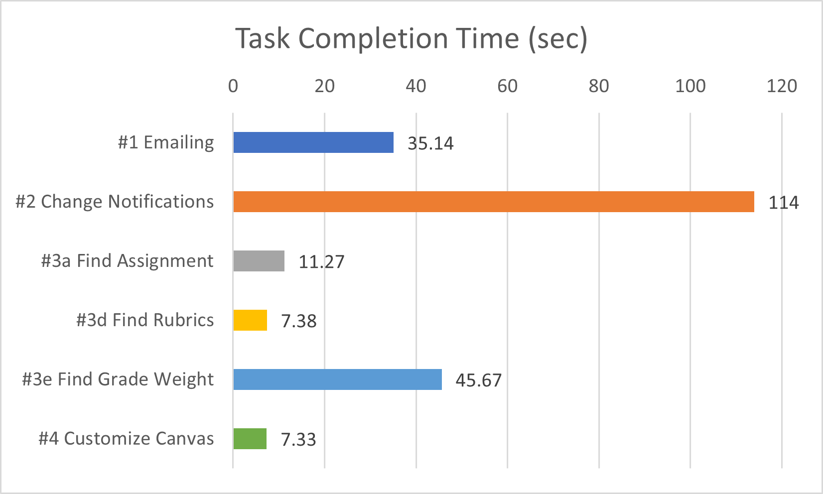
To understand the flow of two common Canvas tasks, we created HTAs for messaging professors and checking grades.
This was used to guide the task analysis (done during the interview) by understanding the process, goals, and checkpoints of these tasks.


🗣 User Interview and Task Analysis
Our target population was students in the US in higher education, and we recruited participants from Georgia Tech who use Canvas.
We gave each participant a series of tasks to perform on Canvas and asked them to think aloud. We timed each task while taking notes on their behavior and thought process.
We also used the interview as an opportunity to ask the participants deeper questions about feelings and habits that could not be captured in the survey.
👩🔬 Analysis
We pooled the insights from the survey, interview, and task analysis into affinity diagrams.

Research findings:
Canvas feels “overwhelming” due to the amount of features - and users don’t even use most of them!
Notifications are confusing and inconsistent across classes
Navigation is convoluted
Keeping track of due dates and assignments is difficult
Customization and control is confusing
❓ What this means for design
According to the findings, we needed to design a solution that ideally meets the following requirements:
Uses an IA which prioritizes content that a student uses most frequently
Makes keeping track of assignments and due dates easy
Allows for simple communication between professor and student
Allows for organization of one’s content
Be easy for new users to pick up
Be aesthetically minimal
Feel consistent across classes
That’s a lot of design recommendations. Could we come up with a design to satisfy all or most of them?
💡 Ideation
As a team, we brought forth ideas and sketches to the table and discussed the pros and cons of each and how they could be improved or changed.
A digital planner focusing on tasks.

A Twitter-like social media app for schoolwork.
A highly customizable “smart planner”.


A course overview timeline.
In the end, we finally settled on a solution that combined elements mostly from the “Course Timeline” and “Digital Planner” ideas because it met more of the design requirements:
✔️ An IA that makes sense
✔️ Custom, visible notifications
✔️ Assignments and due dates highly visible
✔️ Organizable
Storyboard
At first we thought we would run with the social media idea, and we storyboarded it.

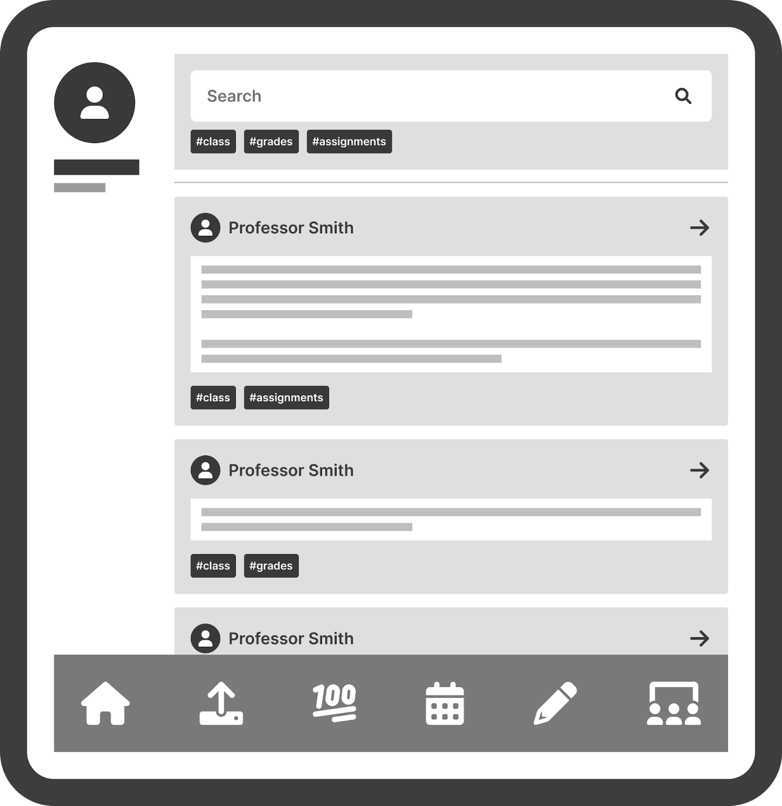
💻 Prototype
See the full interactive prototype here.

The home screen contains class information and upcoming assignment info without being overwhelming.
Notifications are visible on the top right and there is a consistent navigation bar on the left with fewer options than Canvas.

Clicking on a course from the side bar or main page will bring up the course timeline and course information all in one place.

Clicking on a week in the timeline will bring up individual assignments and their respective info with a place to turn it in.
Comparison to Canvas
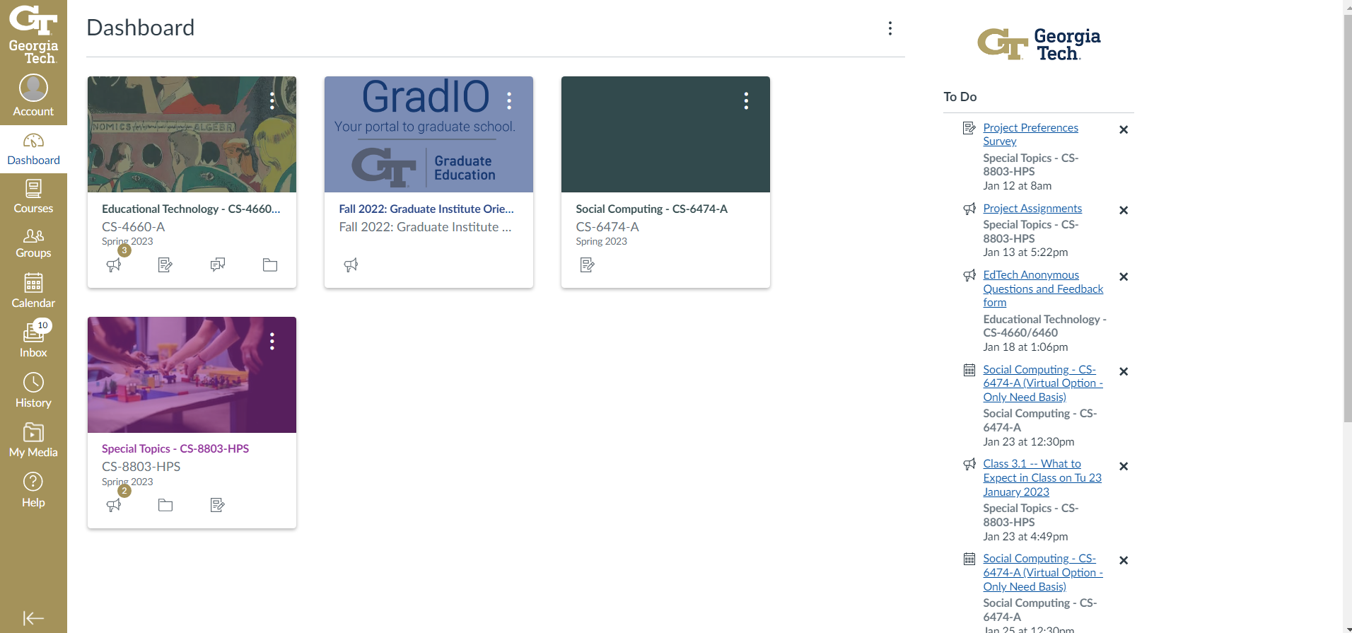
Seeing all features requires scrolling to the bottom; there is a long list of To-Do’s.
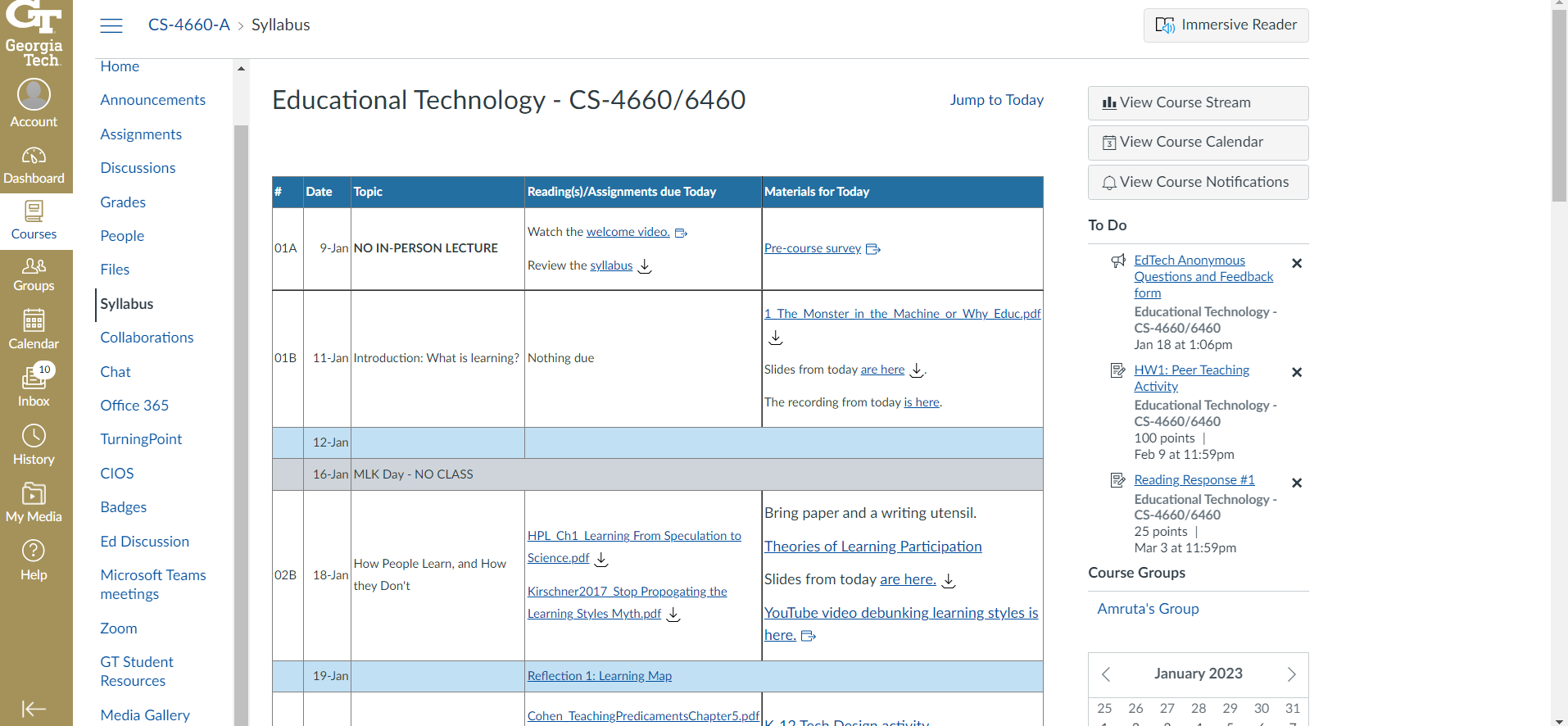
There are two navigation bars on the left with endless features; many of them will open up a new page.
📋 Evaluation
Lastly, we used another task analysis and interview to formatively evaluate our prototype.
We gave the prototype to a sample of students in higher education and asked them to think aloud and walk through a set of tasks which was almost identical to the Canvas task analysis.
We condensed our findings into a FigJam board and evaluated how they met our design requirements.

4 out of 4 participants in the usability test preferred our platform over Canvas.
👍 Strengths of design:
➕ Most used features are easy to access
➕ Simple interface that was easy to pick up
➕ Relevant info about classes and assignments were easy to find
👎 Weaknesses of design:
➖ The Notifications section needs more clarity
➖ Users confused about grades on dashboard
➖ Users don’t think the month view is helpful
🤔 Final Thoughts
The next step would be to continue our formative research and improve our prototype based on the weaknesses above.
Reflecting on the process, I really would have loved to give more time to ideation, as I think a more novel solution could have been developed given more time.
Finally, I think team dynamics could have been better with more patience from everyone, including me! Working with others on a design-heavy project requires empathy and humility.