
Revamping the Admin Notification System for a Cybersecurity Platform
In this study, you will learn about how I understood an essential process for networking admins — assigning notifications — and how I helped design an effective solution for a user group within a niche and highly technical field.
👓 The Specs
Client: a major network & security platform; has over 13,000 customers, including 375 of the Fortune 500
Timeframe: 12 weeks
My role: UX Researcher
Team: me + one UX designer
Supervisor: Sally Cohen, UX Manager
Methods: competitive analysis, Gainsight engagement, unmoderated usability test, user interviews
Tools: Gainsight, Miro, UserTesting.com
This project began with a simple question within a very complex domain.
How do we help admins of our cybersecurity software setup their notifications?
In the networking and security world, notifications are of utmost importance. They tell our admins when something is wrong with the network, which thousands of end-users rely on 24/7.
To begin, I had to understand what my users do, what they struggle with, and what the current notifications system looks like.
Research
I did three things to understand the problem space:
Background research
Looking through a previous study that had been done — past notes and old interview videos — and summarizing what I learned
Studying the company’s existing user personas
Competitor Analysis
A quick and simple look-through of other networking platforms & roughly mapping out their user flow
Early internal interviews
Asking our subject matter experts (SMEs) what they like and dislike about our platform’s notifications

A glimpse into my background research process.
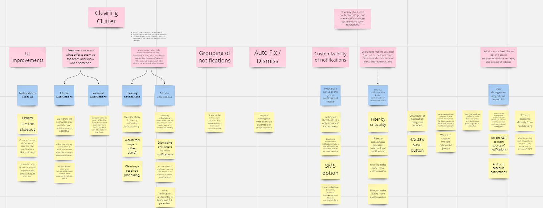
I uncovered very strong opinions from this research.
The heart of the problem was that:
The notifications aren’t useful.
The process for setting up notifications is convoluted.
Because of 1 and 2, most people don’t touch notifs, or simply turn everything off.
The ‘usefulness’ of the notifications was due to the limited amount of information carried by the notif, and the fact that they aren’t actionable.
Our PM decided that he wanted us to focus on first fixing the notifications process — in other words, problem #2 — a logical first step.
Iterative Design & Testing
I had only ~10 weeks for this project, so I planned for 2 rounds of testing.
The first round would be recruited from online and unmoderated, as a quicker review of our design, to see if we were on the right track.
The second would be a more refined design and put in front of our customers through a moderated test.
My considerations for this plan were:
amount of time remaining
time it takes to ideate, wireframe, and prototype
time it takes to recruit & schedule
target number of participants
How I approached ideation
First, mapped out what the current process looked like
Second, mapped out a proposed (and rejected) process from a previous study
Third, discussed what might’ve went wrong in each flow and mapped out possible flows that solved those issues
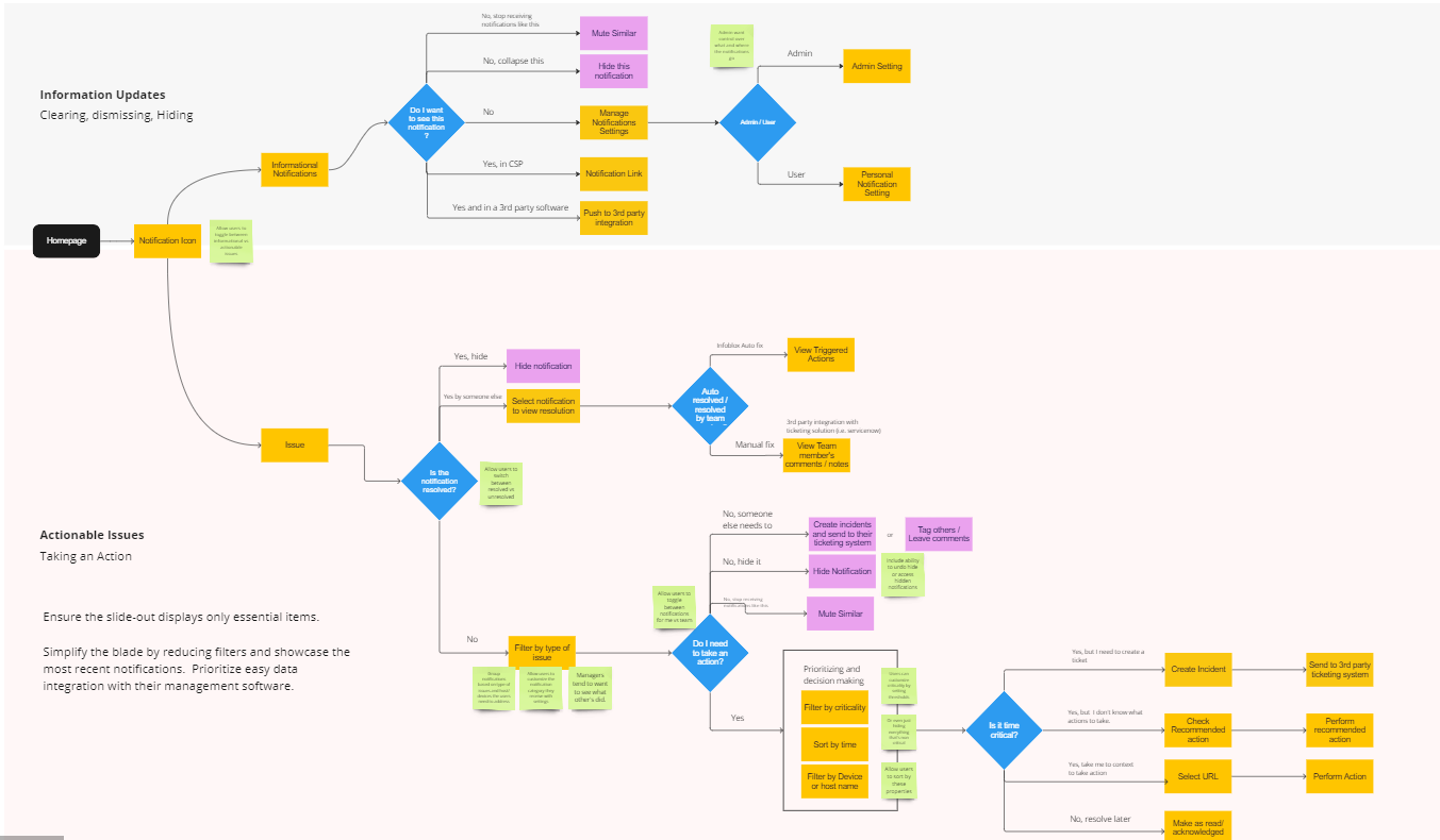
We brought our ideas to our UX manager & PM and agreed on a flow to proceed with wireframing.
We then put our wireframes in front of our SMEs again for feedback and made some design adjustments before moving onto our first round of testing.
Unmoderated Testing
I designed a usability test for our first prototype such that it would capture the users’ mental model for setting up notifications.
Recruitment for our first round of testing was a unique challenge because of our niche user group. I used usertesting.com to screen candidates who:
a) are admins of a networking/cybersecurity platform
b) have the responsibility of setting up notifications for their organization.
The Results
Participants were split on whether they wanted to assign notifications to users, or vice versa. Thus, we decided that our next design should be flexible for admins.
We also had to consider that we had many longstanding customers who are used to doing things a certain way. We didn’t want to overload our users with too many new concepts at once.
Iterating Again
I had plenty of creative ideas but I didn’t want to overengineer the problem.
Some design requirements I gathered from my previous test:
keep things simple, as setting up notifications is a process that happens infrequently.
reuse major concepts, for our decades-long customers.
allow admins multiple routes to assign notifications.
allow for more granular notification assignment.
The Prototype

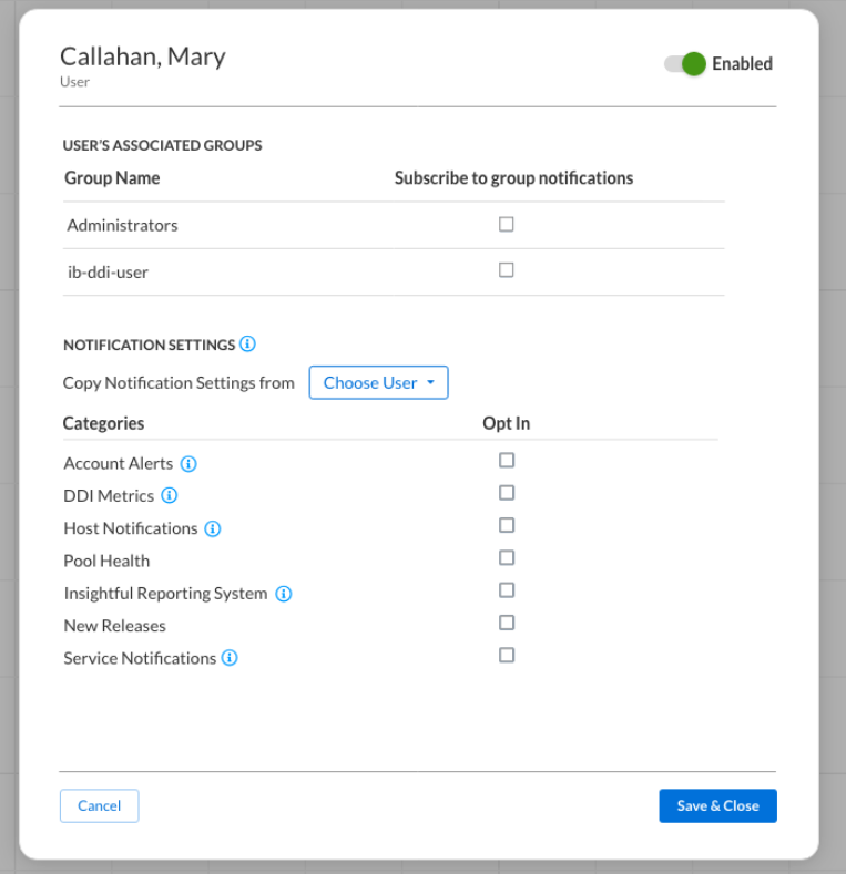

Prototypes designed by Senior UX Designer Kadence Tang.
How it meets the design requirements
familiar — reuses concepts from current platform: the “user group”, with checkboxes for notification type
flexible — can view or assign notifications by user or by group
granular — can opt out an individual from the group
Moderated Testing
I ran a Gainsight engagement on the admin pages of the company portal to recruit participants.
I had to additionally recruit from Usertesting.com to round up enough participants.
Because this usability test was moderated, I was able to interview the participants in addition to assigning them usability tasks, allowing for deeper insight into their role as an admin.
The Results
“I don’t think anything could be better, frankly...
It is designed by somebody who knows what he’s doing, who has actually used it before.”
“Very intuitive, very clear.
It’s extremely guided for somebody who doesn’t necessarily come in here all the time and facilitate notification settings changes. ”
The layout and flow were both liked and easily understood. Participants described it as “intuitive”.
The details added to the usability, such as hovering over a notification category for more information.
The granularity was well-liked, but paradoxically some participants struggled to come up with a use case for it.
My Takeaways
This was the most challenging problem space I’d ever worked on! Learning what my users do and understanding their vocabulary was not easy.
Furthermore, my designer and I spent many long ideation sessions going back and forth, finding holes in the flow that weren’t obvious at first. It was challenging but fun, like a puzzle.
It was incredibly rewarding to hear such glowing feedback from our customers! I felt that all of my hard work had paid off and I had truly contributed something valuable to the company and its users.
In the end, this project reinforced my love for being a researcher.